Causes of Congestion Tool Features and Navigation
The Transportation Disruption and Disaster Statistics (TDADS) dashboard was created to compile and
archive operational-related information into a data system that provides standardization of transportation
system disruption, resilience and disaster statistics nationally. This tool considerably upgrades and
enhances the Sources of Congestion – National Summary pie chart developed in 2004, with features and
functionality that allows for more comprehensive congestion causes categories and robust analytics.
Definitions
| Recommended Terminology |
Data Sources |
Definition |
Details |
| Congestion |
1- minute probe data |
A sustained interruption in the flow of traffic that results in travel delay. |
- Time and location of an event that causes a speed drop of at least 60% of the reference speed. This location is the head of a traffic queue.
|
| Causes of Congestion Sources
| Recurrent Disruption |
1-minute probe data |
A predictable and regular pattern of interruption in traffic flow that results in travel delay. |
- Disruption pattern that is predictable in both space and time and is observed on a regular basis.
- Typically caused by surge in demand near or above the capacity of the corridor
|
| Incidents |
Waze |
Interruption in traffic flow caused by an unplanned in-road or roadside obstruction that results in travel delay. |
- Disabled vehicle
- Crash/Incident
- Emergency roadwork
- Road obstruction
|
| Weather |
NOAA Radar |
Interruption in traffic flow caused by inclement weather conditions. |
|
| Work Zones |
Waze |
Interruption in traffic flow caused by a planned construction or maintenance project/activity. |
|
| Holiday Travel |
Holidays & Travel Days |
Interruption in traffic flow caused by a scheduled occasion. |
- Before, on or after major holidays
|
| Signals |
OSM Traffic Signal Database |
Interruption in traffic flow near traffic signals. |
- Delay incurred at signalized intersections
|
| Multiple Causes |
Multiple |
Congestion event caused by more than 1 factor |
|
| Unclassified Congestion |
1-minute probe data |
Interruption in traffic flow with no discernable cause. |
- Disruption/congestion with unknown cause (ie. no matching causation event)
|
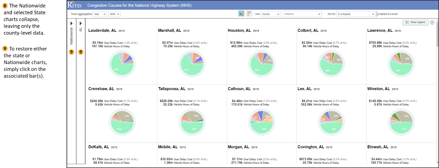
Shown below is the landing page after you log into the system.
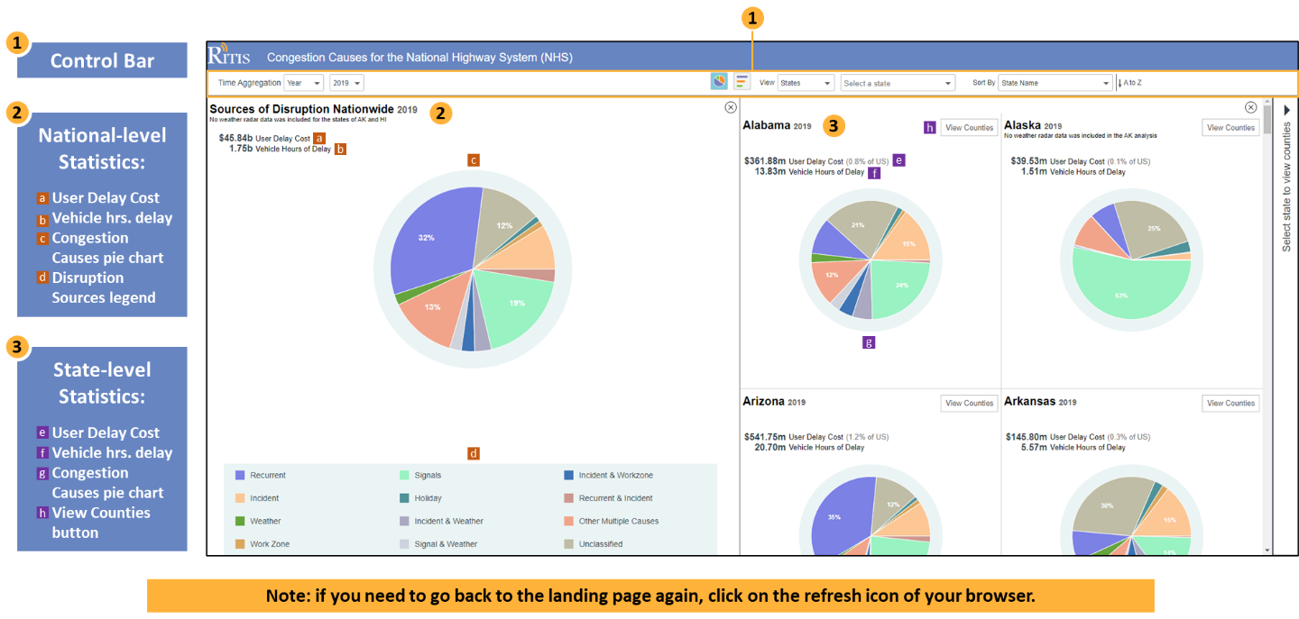
Control Bar Overview
At the top of the Congestion Causes dashboard is the control bar where you’ll quickly and easily
assess sources of disruption to traffic at a national, state and county level for the National Highway System (NHS).
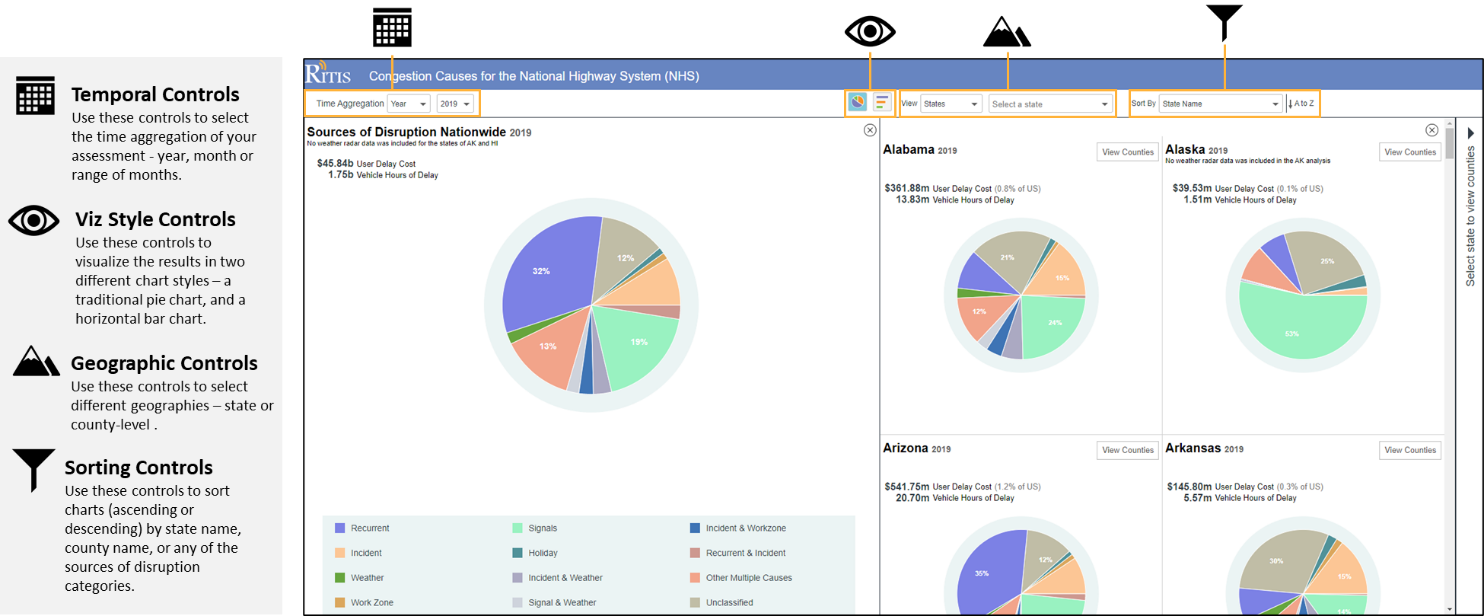
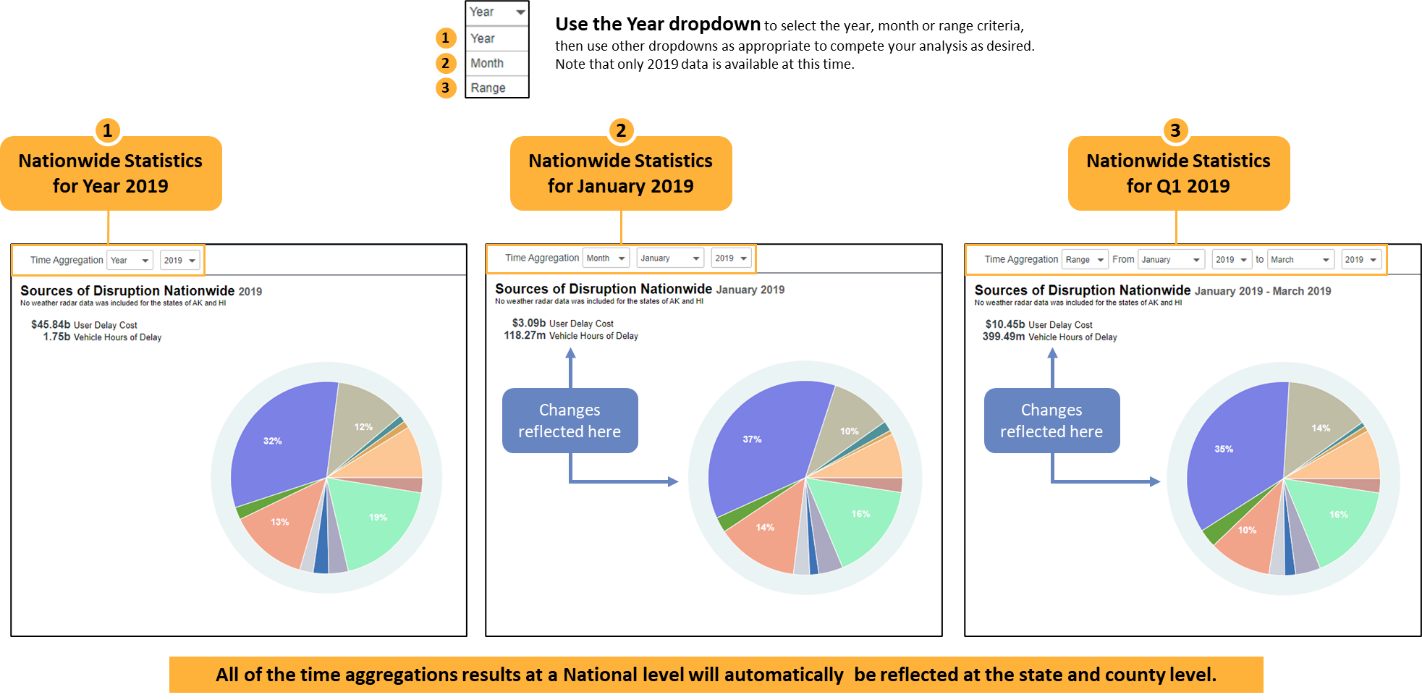
Temporal Controls
Use the two drop downs in Time Aggregation to select the year, month or range of months to visualize variations
in the disruption statistics by time period. Both the pie charts and Probe Data Analytic statistics
(User Delay Cost / Vehicle Hours of Delay) will update, reflecting the selected time periods.
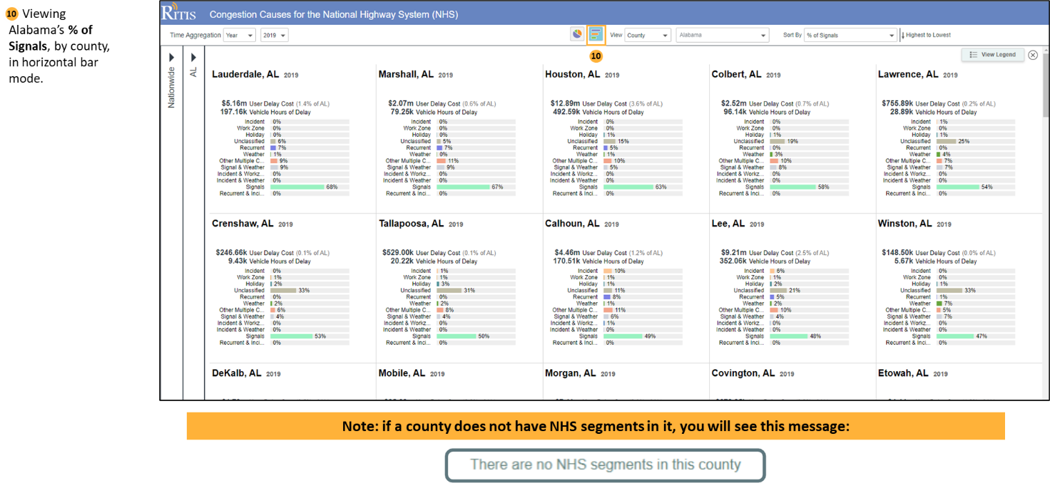
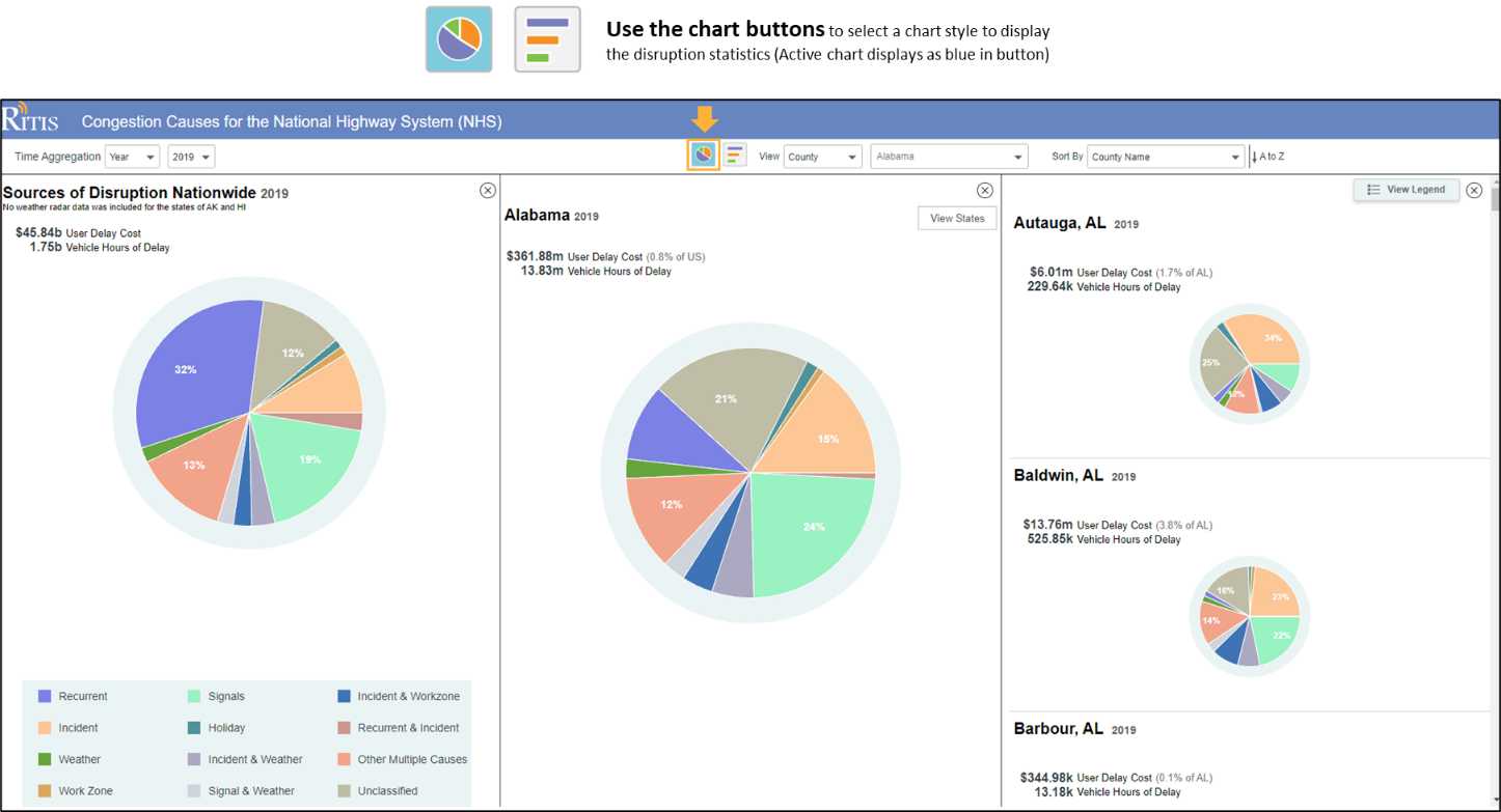
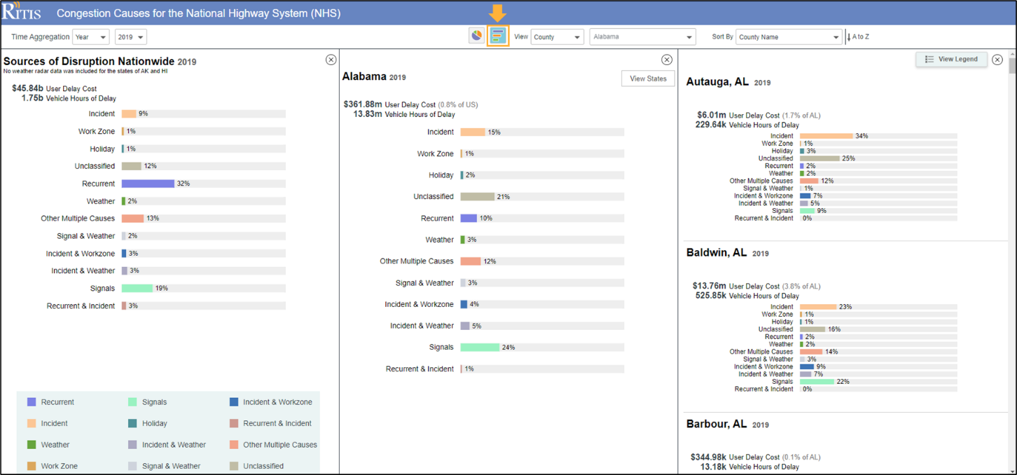
Viz Style Controls
Use the two chart buttons to toggle back and forth between chart styles – pie chart or horizontal
bar chart – to display disruption statistics that are most amenable to your particular situation.
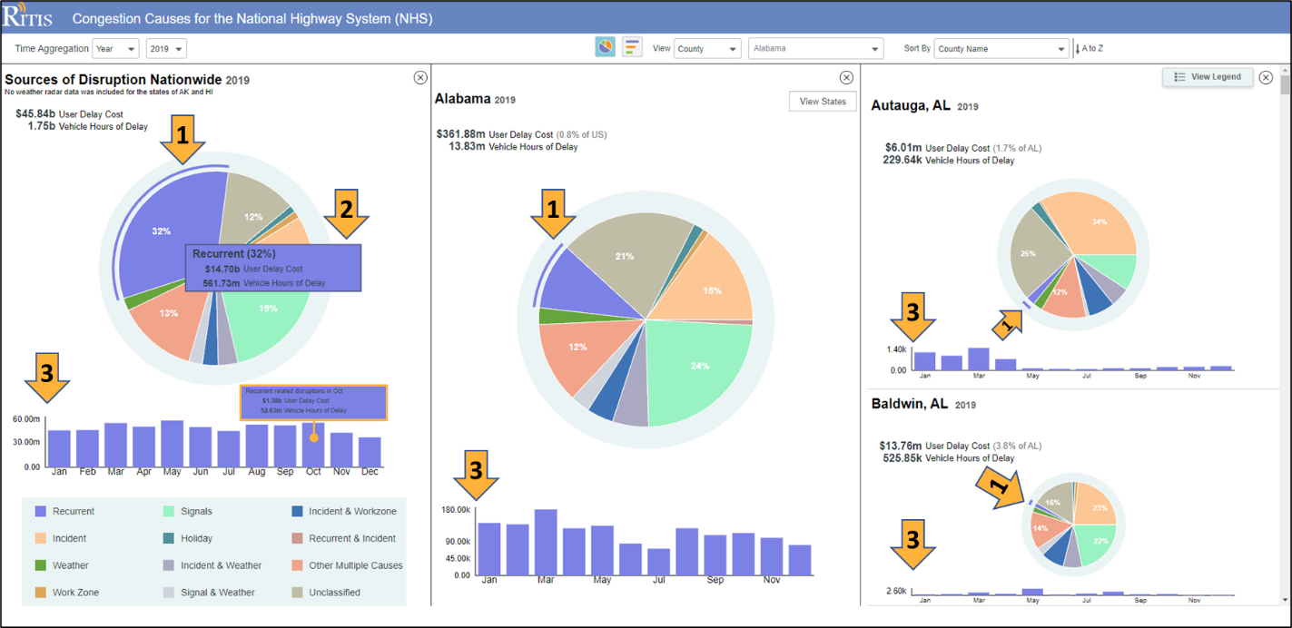
Selecting a Disruption on a Chart
For any pie chart or horizontal bar chart – at a national, state or county level – clicking on a
disruption source in a chart will: 1) highlight that source in the chart with an arc (pie chart)
or bar (Horizontal bar chart); 2) provide a pop-up of information pertaining to that disruption source,
and; 3) generate a strip chart showing month-by-month variations for that disruption source
(hovering over the bars will show month-to- month statistics).
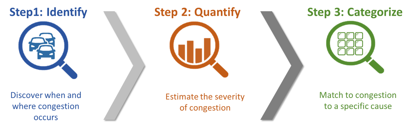
Causes of Congestion Methodology Summary
The analysis steps for creating the causes of congestion pie charts can be generalized as the
identification, quantification, and categorization of congestion. The generalized process is
conceptualized in the figure below.
Generalized Causes of Congestion Analysis Steps
Further details on the causes of congestion methodology are provided in the data flow diagram
and logic diagram below.
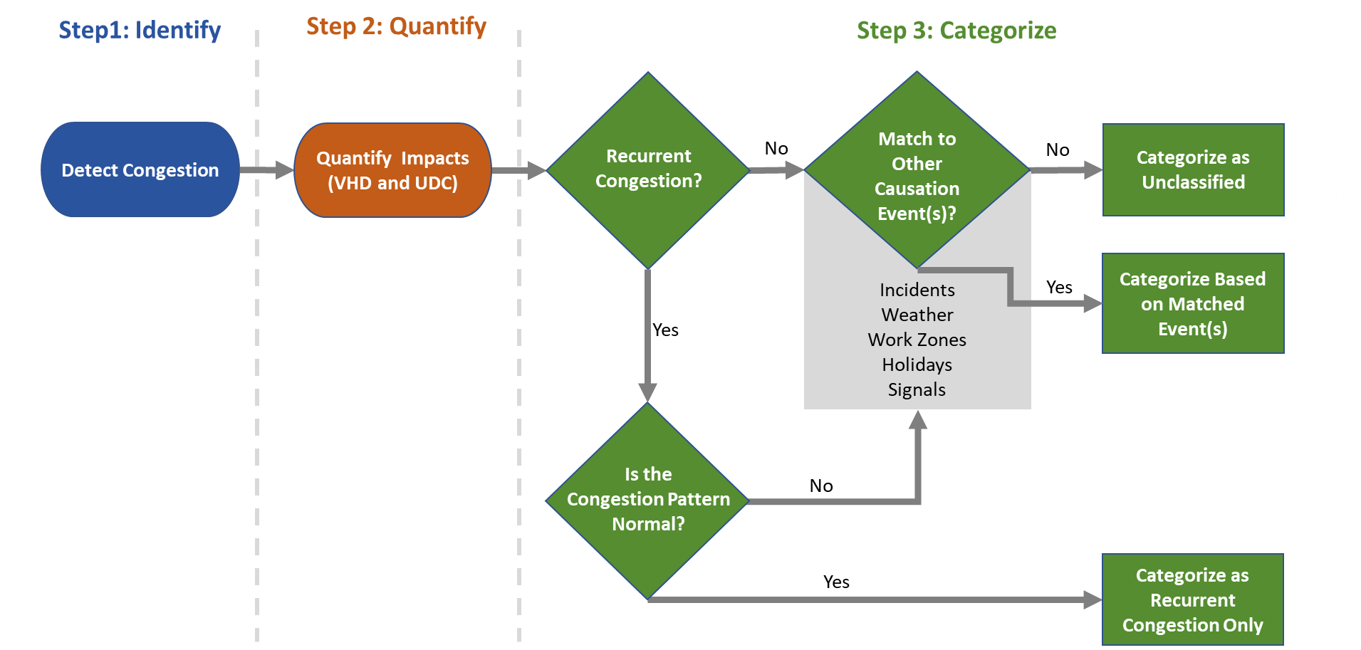
Causes of Congestion Data Flow and Logic Diagram
As shown in the above figures, the basis of the causes of congestion methodology begins with
identifying when and where congestion occurs. As described in detail in the bottleneck ranking
tool help page, congestion is defined as an observed speed that is 60% or less of the free-flow
speed that is sustained for at least five minutes. Once these conditions were met, a bottleneck is
activated, and the quantification step is initiated. Delay is estimated each minute based on the speed
drop and queue length associated with each bottleneck head location until the head location returned to
at least 60% of the free-flow speed for ten minutes. The total delay for each bottleneck is computed by
multiplying the delay by the impacted traffic volume and then aggregating the one-minute delays for the
entire period that the bottleneck is active. Delay is estimated as both vehicle hours of delay and user
delay costs, assuming a constant vehicle classification of 90% passenger vehicles and 10% commercial vehicles.
The value of time for passenger and commercial vehicles is assumed to be $17.91 and $100.49 per hour, respectively.
The last step is to assign the total delay for each bottleneck to a causation category. As shown in the data
flow diagram and logic diagram, this process begins by looking at the temporal congestion pattern. If the
delay pattern is similar to the historical pattern for the time of day and day of week of the target bottleneck,
the bottleneck was categorized as a recurrent bottleneck. However, if the delay pattern was different, additional
causation causes were considered. In a similar fashion, if the congestion was deemed non-recurrent, alternative
causes were assessed including multiple causes as well as an unclassified category for instances when a cause could
not be determined. Each bottleneck is assigned to a causation category and the results are then aggregated by month
and county. The counties were aggregated to build the state results, and the states were aggregated to build the national results.
Additional Methodology Remarks
2019 weather radar data in Alaska and Hawaii was explored but deemed to be not appropriate for this study.
In these states, only Waze weather events were included in the weather category. However, the team discovered
a compatible weather radar for Alaska and Hawaii that is available from July 2021 onwards.
It was possible for bottlenecks to straddle counties and/or months. In such situations, the total delay
for each bottleneck was assigned to the bottleneck head location and start time. To illustrate this concept,
consider the real-world bottleneck on the outer loop of I-495 (Capital Beltway) at the interchange of Georgia
Avenue in Maryland (blue circle). The head of this bottleneck is in Montgomery County, Maryland (green polygon)
but the associate queue (blue polygon) spills into Prince George’s County, Maryland (purple polygon). The total
delay from this bottleneck was assigned to the head location and was therefore included in the Montgomery County
results. Similar logic was employed when a bottleneck straddled multiple months.
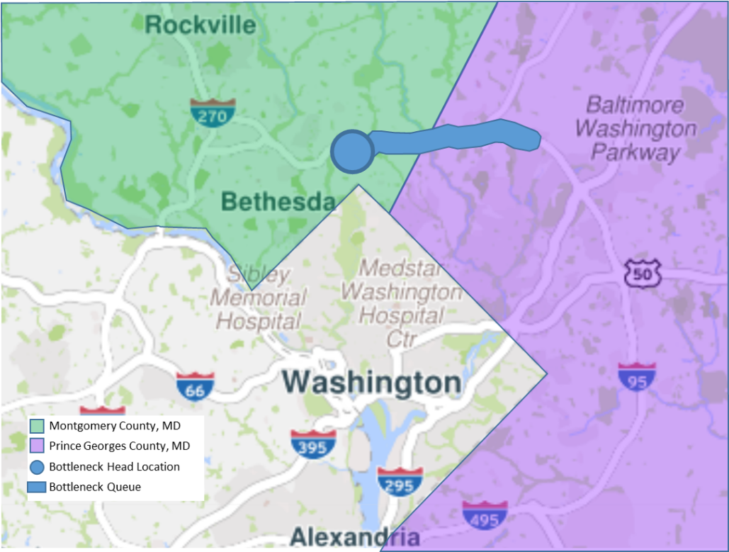
Spatial Designation of Bottleneck Impacts (example on I-495 in Maryland)
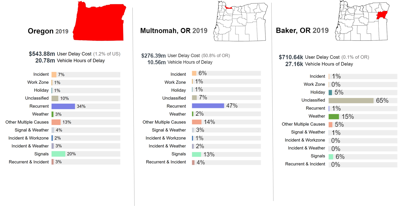
Rural counties tend to have more unclassified congestion. This observation is explained by limited causes of
congestion data sources in these regions, especially Waze data coverage that is used for incidents and work zone
events. Meanwhile, urban counties tend to have larger contributions in the recurrent congestion category. This
finding is consistent with expectations of peak period travel observed in urban environments. To illustrate these
findings, consider Multnomah County, Oregon (which contains Oregon’s city, Portland) and Baker County, Oregon
(a rural county in eastern Oregon). The 2019 causes of congestion for the state of Oregon and these two counties are
presented in Figure 5. Multnomah County comprised 50.8% ($276.39m) of the total delay in Oregon while Baker County
contributed 0.1% ($710.54k). The recurrent congestion in Multnomah County was 47% while recurrent current congestion
was 1% in Baker County. Unclassified congestion in Multnomah County was 7% and Baker County had 65% unclassified congestion.
This finding is explained by the differences in the causes of congestion data sources available in urban versus rural
areas. Multnomah County Multnomah County had 233,566 Waze events while Baker County had 7,970 Waze events in 2019.
Comparing State Results to Urban and Rural Counties